Few things are as important as the colours you choose for your home. It’s the first thing people see. It creates the atmosphere. It creates the mood and feel of the different spaces in your home. Colour is about as important as it gets.
Here are a few things to think about when making colour decisions.
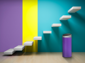
The same colour can look different in different circumstances. Contrast is critical. Surrounding colours can dramatically affect how we perceive a colour.
Surface area and distance: whenever I see a colour that is over powering because a whole room has been painted in one strong colour I imagine the home owner choosing from a small tile in a paint shop. What they wanted was a splash of colour not a tidal wave.
Distance has a similar effect. Colours that are further away have a lower effect.
Texture: glossy is cool, soft and dry is warm. Rough and smooth textures affect how we react to the colour.
Natural light: this varies according to climate, the time of day and direction. We will respond differently to the same colour if it is in a south facing room in Spain of a north facing room in the UK. What time of day will you use the room? Is it a morning room or an evening room?
Artificial Light: Tungsten gives you a warm light that reflects back from warm colours but makes cool colours appear dull. Halogen is close to natural light, Fluorescent gives a cool watery light that can reduce vibrancy in some colours. LED…..well LED is changing all the time and there is already a wide variety of tones.
Culture: different cultures see colour in different ways for example you wear white to a funeral in China. I wont even begin a discussion on what red means in Spain (the flag is red and yellow) but to me it means, stop, danger…..blood! (In fact red is considered lucky in China).
Combining Colours: there are three approaches:
- Tonal variation ie lighter and darker shades of the same colour,
- Harmonisiing with two or more colours. Professionals may use a colour wheel that has red, yellow and blue at 120 degrees from one another and creates a secondary shade by progressively blending with the next colour round. Therefore, a typical harmonious scheme may match blue and violet, or green and turquoise.
- Contrasting that uses colours that are opposite each other on the artist’s colour wheel. This often creates a dramatic and contemporary feel.
Atmosphere: Think about the atmosphere you want to create. Reds and yellow are often thought to be warm colours while green and blue are relaxing and tranquil. The degree of saturation is important. Are you looking for something assertive even brash or something understated and sophisticated? All the colours must be considered in terms of the shapes spaces and ceiling heights that you have.
Colour Names: As paint manufacturers come up with names like “Tuscan Glade” architects and designers have come up with some objective scales Natural Colour System; RAL; British Standard 4800, Pantone, and Dulux Trade Colour Palette.
Here are some other words that may help you bluff your way through the discussion with your interior designer.
- LRV: the light or darkness of a colour on a scale 1-99 depending on the percentage of ligh reflected from the surface
- Hue: the colour family
- Chroma: the colour intensity
Author: John Wolfendale
Bio: John is a founder of Eco Vida Homes and is passionate about bringing modern design and construction practices to Spain. He believes a home which is warm in winter and cool in summer is largely a matter of design and selective use of materials. He is British and a Chartered Surveyor with over 22 years experience living and working in Spain.